Thursday, 5 April 2018

Ancillary Tasks Photoshoot Part 3

This shot shows the actress squinting to see something which immediately deducts from the real focus of the shot. However some people would say that this image was still useful because it would lead the audience to be intrigued as to what she was looking at. I disregarded this shot because I wasn't convinced that it would look effective in the production of my ancillary tasks.
In this shot the actress' eyes are much wider than in the previous shot. This is effective because in the thriller genre, characters are typically on edge and more alert because of the action taking place. I prefer the darker colours of the bricks in this backdrop as opposed to the orange ones in previous shots. These bricks are red and this has connotations of danger and violence. Despite this, I disregarded the shot because I wanted the actress to have direct eye contact with the camera to engage the audience.
I think this shot is good because there are lots of useful places to position edited pieces like text and/or other images. For instance, unlike the other shots, the trees at the top do not cover the entirety of the backdrop so a main header would fit well in-between them. The edges of the brick wall also have gaps where the actress is stood in the middle, leaving room for subheadings and images etc. This off guard shot has potential for further film advertisement, however for my main ancillary tasks I would like my actors to be looking directly at the camera as opposed to shots like this where she is looking down towards the ground. I disregarded this image.
I really liked the way that this photograph came out because I thought it looked professional. Despite the fact that the actress is not gazing directly at the camera I think it is an effective image because the subject focus is clear. I like the blur of the trees in the backdrop as it means they are not the main focus of the photograph but they add depth and texture to the image. The gaze into the distance portrays a sense of foreshadowing to the audience. Unfortunately I did not see how this photograph could work well with the thriller genre or codes and conventions therefore I did not use it for my ancillary tasks, however I do think it would be effective if my film was of another genre or had another message.
This shot is effective because there is a lot of emphasis on the fact that the actress is holding/hiding something in her pockets. I gave her a large prop to use to hold in her hand inside her pocket to imply that she could potentially be holding a weapon of some kind- to fit in with the thriller genre of the short film. The smile on her face is not the expression I was looking to use on my ancillary tasks so I disregarded this shot.
This side angle was to experiment with the body language being portrayed in each image. Having her turn her head from the other direction was effective as it created a more closed form of body language in order to fit with the genre as generally characters are more secretive in thrillers. The lighting on her face highlights the focus on the actor in the shot too. I like the backdrop of the bar she's sat in front of. Metal bars are often associated with prison cells which automatically implies there is trouble or danger to come. I disregarded this shot upon finding another, more effective image for my ancillary tasks.
This image is clever because of the way it has captured the actress as the central focus of the photograph but her focus is on something else. It is more effective in portraying a stereotype of the youth because she is glued to her phone which is common in this day and age. I disregarded this shot because, despite it being a good representation of youth, I did not think it was the most engaging shot for my target audience.
I like this shot because there is further use of the bars as the textural background which I believe to be fitting for this genre. It looks as though she is not looking directly into the camera but past it. This could be implying that she cannot see the camera or has chosen to ignore its presence. I think that the way one hand is obviously stuffed inside a pocket is effective because it is hinting towards her hiding something. I disregarded the shot because it looked as though she was smirking and this made it less effective for my particular target audience.
This shot is interesting because you can see the actress' reflection and it is the reflection that is looking directly into the lens of the camera. This look as though it is a two frame shot which I think is effective because of the thriller genre. Although the reflection is seen, it is not as clear as I had aimed to capture so I disregarded this shot. The reason behind this part of the shoot was to show two sides to the personality in one person.
This is similar to the previous shot but the thought process behind this shot was to edit the reflection so that it also had a direct gaze with the camera. As the shot cuts off some of each side of the picture, I did not think the edit would be as effective. For this reason I disregarded the photograph and decided to choose others for use in my ancillary tasks.
The idea behind this shot was to experiment with natural lighting and to emphasise the difference between a good and bad side within somebody. The way that the light shines down half of her face is effective as this is where it would be edited darker to show the significance to this genre. I didn't like how there was also shadow on the right hand side of the photograph as this deducted from the point of the shot itself. I disregarded this photograph.
This was another lighting experiment, similar to the shot above, however this time I wanted to capture a more off guard shot. This resulted in the shadow of the lighting moving and I did not like the effect this created so I also disregarded this shot.


These shots are fairly similar because of the location in which they have been shot. The main difference is that one has a direct gaze with the camera and the other one doesn't, automatically making one more engaging. I disregarded these shots because I didn't think the background enhanced the photos as well as the other backdrops, nor was it relevant to the short film. I like the angle from which the shots were taken as I think they frame the actress nicely and could be used for other advertising work for the short film.

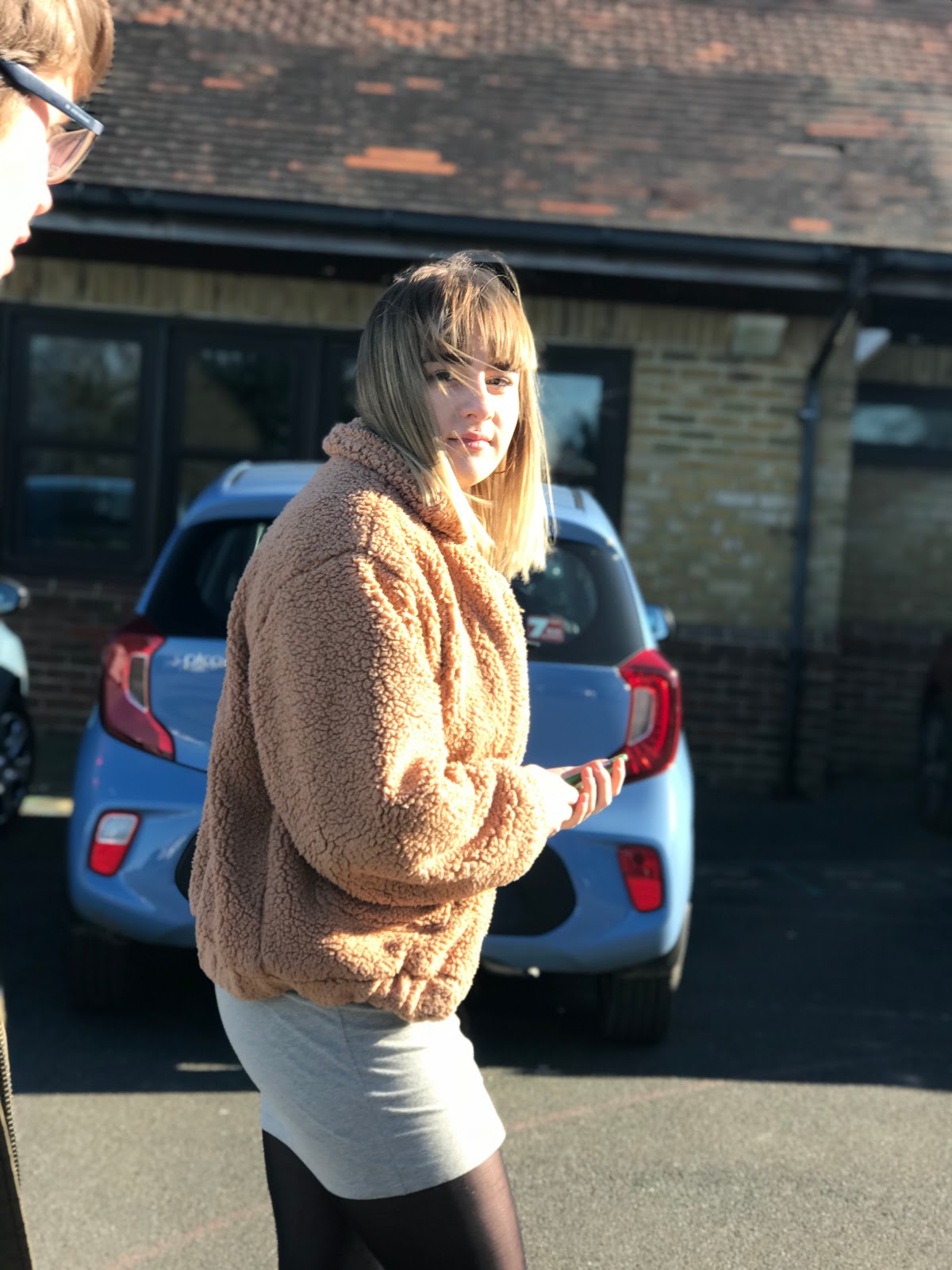
This shot is effective because she is looking directly into the lens of the camera and maintaining a gaze with the audience. The expression on her face is serious so an audience would be unable to read how she is feeling, making it more intriguing as to what the film is about and further encouraging them to find out. I like the way that she is in focus but the background o the cars isn't; this means that all of the photo engagement is with the actress in the photo as opposed to anything else. This shot would be useful for a film poster however I have decided to use another actor to advertise my film poster as it is more fitting with the plot of my film.
I like this side profile shot of the actress because of the way she has been captured in the moment. Her facial expression looks as though she could be in deep thought or plotting something so this bodes well with the plot of my short film. The way she is sat with her legs crossed and fiddling with her scarf portrays a child-like quality and connotes some innocence in her character.For my ancillary tasks I decided I preferred the idea of the actors looking directly into the lens of the camera so I disregarded the shot, however I do like the outcome of this photograph.
I like the way that the actress is looking up towards the camera as this makes the target audience feel more empowered looking at the magazine. The direct gaze at the camera is effective because this creates an immediate connection with the audience. The black and white square she is sat on creates an interesting texture for the rest of the photograph, as opposed to being in front of something plain. Her mise en scene is typical of her character which effectively presents this generation to the target audience. I chose this shot to use for my second ancillary task as I thought it worked well with the ideas I had in mind for my design.

Ancillary Tasks Photoshoot Part 2

For this actress I decided to do some of the photoshoot with a hat and some without. This was to see the effects created by adding different mise en scene. I stood at the right hadn't side of her because the sun was shining down to the left, so this created a shadow on one half of her face. Like the other photos, I wanted to emphasise how every person has a darker side to them and a shadow creates this connotation effectively. The direct eye contact with the camera is effective because it is more welcoming to an audience. The fact I have used a female actress is significant because some might say she has been framed for the male gaze and will gain a male following for the film through this advertisement. I disregarded the shot because of the smile as I was looking for a more deadpan facial expression.
This shot was taken from the opposite side to the previous one and I asked the actress to move her body so that it was all seen in the sunlight. By looking away, this does not immediately grab the audience's attention nor does it create a connection with them. Looking away could connote that she does not want to be seen and that she is more focused on something out of the shot. I disregarded this photo.
This is similar to the previous shot except here she is looking directly into the camera. I thought that this shot could be useful in the ancillary tasks because she has a deadpan expression, has been shot in the right lighting and categorically fits into the correct genre. However, after looking through the photographs I shot, I decided to go with a different image so I disregarded this one.
I liked the brick wall as the backdrop to the shots so I decided to change the stance of the actress so a sitting position. Having her sat on the floor with her bag on the wall and hands in her pockets creates a more stereotypical youth look. This was more effective in terms of creating the right age range for the target audience. I decided the lighting was too bright for what I was looking for so I disregarded this shot.
Like many of the other shots I took I wanted to experiment with something that looked more off guard and relaxed. Unfortunately the sun was too much in her eyes for her not to squint when looking down, making it look as if her eyes are completely closed which is not what I was looking for.
After using the brick wall as a backdrop I decided to go back to using the car for the actress to work with. The car is significant in my short film as it is their transport to and from places so it is central in the action. The stance that she has is casual and typical of a youth which is why I think it is effective. I think that this shot was captured too far away and the lighting is too dark for it to be useful in my ancillary tasks.
This is similar to the previous shot, however I changed my position with the camera so that I was closer to the subject. This made a huge difference in terms of how effective the shot was. This made the lighting brighter and meant you could see the actress better overall therefore the focus of the shot was more accurate. The direct eye contact with the camera is effective in creating an immediate connection with the audience. After contemplating using this photograph, I found another that worked better for my ancillary task so I disregarded this one.

This was another closer shot but this time I asked the actress to look away. The slight smirk on her face looks mischievous and implies that she has other things on her mind. Having her hands in her pockets also emphasises this deviant youth look I want to portray for my particular film genre. I disregarded this shot because the lighting I captured was too dark.

In these shots I asked the actress to maintain direct eye contact with the camera whilst changing locations so that this would be welcoming to the target audience. However, despite the effectiveness of these photographs I thought that her facial expression was too happy to fit in well with this genre and portray what I wanted to display to the audience. I disregarded these shots.

I also disregarded the shots above because the backdrop was not an effective place to shoot images and it had no relevance to the short film. I like the facial expression of the actress in the shot on the left because it does not reveal her emotions and the hand beneath her chin suggests she is in deep thought. This welcomes the audience in to her trail of thought. I thought that she looked too happy in the shot on the right which was not what I was trying to portray in my ancillary tasks. What I did think was successful about these images was the camera angle as I thought the closeness of the shots made them more personal and engaging for the audience, thus they could be used for another task.

This shot was taken from a low angle whilst the subject was stood looking down towards the lens of the camera. The lighting is shining straight on to the actress and highlighting her significance in this shot. I think that it is too bright for what I was looking for from this image. I like the way that she is stood turning slightly away from the camera emphasising how she is not willing to reveal everything about herself. The direct gaze towards the camera is welcoming to the target audience, however this image did not come out as I hoped it would look so I disregarded this shot.
This was my favourite shot of this actress and one I plan to use within my ancillary tasks. I think that using a shot revealing more of a side angle as opposed to central is more effective as this indicates the character is not willing to reveal everything about themselves, fitting in well with the thriller genre. The way her hands are in her pockets makes the audience think that she could be hiding something. It could also be interpreted as her being relaxed and laid back, like many stereotypical teenagers- which appeals to the target audience correctly. The lighting is good because it highlights the focus of the whole photograph without being too bright and overpowering the image. I think that this actress looks better in these photos than with the added mise en scene of the hat because this way there is less distraction from the significance of the photo. I like the use of facial expression in this shot as one of her eyebrows is slightly raised, looking inquisitive. This intrigued gaze engages the target audience effectively according to the research I performed on my short film genre and audience.
This shot is similar to the previous one except it's from another angle. I think that it came out well but there is slightly too much lighting on her face causing her to squint which detracts from the aim of the photograph. I think her stance is effective but after seeing a better-fitted photograph for my ancillary tasks, I decided to disregard this one.
This shot is of the actress looking down at the car door about to get in and travel somewhere.The location of this shot is useful because it hints that the car will be relevant to the action taking place in the short film. The fact she is looking at the car instead of the camera is significant as this could indicate she is unaware of the camera's presence or that she doesn't want to be seen going anywhere. Keeping her eyes down and her body language subtle, this makes it easier for her to act casual. I disregarded this shot because I wanted one where she was looking into the camera, however it looks as though it could be useful in advertising it somewhere else.
This shot is of the actress approaching the car door as if she is about to open it. I like how she has caught the gaze of the audience through the eye contact she is making with the audience. This shows that she is about to perform an action but she is making it clear that she is aware of the audience'e presence, which is fitting for the thriller genre. I disregarded this shot because it was not what I was looking for in my ancillary task work, however it could be used in other advertisement for the short film.
This shot shows the actress laughing to herself as there is nobody else in the shot. Depending on the context laughing is a happy emotion, despite sometimes meaning somebody is nervous. Laughter can also connote evilness as this is stereotypical in a thriller genre for an evil character to laugh at their actions. Having different interpretations of laughing I think this is effective because it makes the image more ambiguous. Having her behind the open car door immediately suggests she is entering the car to go somewhere. This is intriguing for the audience as it is not clear as to where she may be going, therefore this is an engaging image. Despite its effectiveness, this is not the sort of image I was looking to use for my ancillary tasks so it was disregarded.
This image also shows the actress getting in the car but from a different angle. The closing of the car door in this shot is not welcoming as the audience may see this as the door is being closed on them, therefore they are not made to feel welcome. The way she is looking down as opposed to at the camera indicates that she may not be aware of the camera's presence and that she is more focused on being somewhere else. As I did not consider this shot to be a engaging for my target audience, I decided to disregard it.
This shot is similar to the others where the actress is leant against the car, however it has been taken from a more central angle. The slouched position makes the actress seem comfortable with where she is, which is effective because generally the audience feel more relaxed when an actor is at ease. I did not like the lighting in this shot for what I had planned for my ancillary tasks so I disregarded it.
This shot was taken from a low angle and it meant that the actress would have to look down towards the camera as opposed to a more direct gaze. She has fixed eye contact with the lens, creating a connection with the audience. The audience may see this image and believe this character to be significant because they are looking down on everyone else. Typically height can be considered to make people look powerful and so by taking this image from a lower angle, it created the illusion that she was taller i.e. had more power. This may not have a welcoming effect on the audience but it does fit in well with the genre. However, I disregarded this shot.
This shot has better. lighting from a lower angle and the stance she is in looks as if she is thinking. Looking at this image from a psychoanalytical point of view it is thought that people look to the left when they are constructing a lie in their mind, therefore this links well with the portrayal of suspicious body language in the thriller genre. I like this shot because I think her body language reveals a few things about her character therefore engaging the audience without having to maintain eye contact with the lens of the camera.
This is similar to the previous shot but she is looking in the opposite direction. Looking to the right is often said to mean you are recalling memories which could connote that she is thinking back to something in the past. This gaze is fitting for her stance which looks as though she is thinking- with her head resting on her palm. I disregarded this shot because I decided that I wanted all actors to have direct eye contact with the camera in my ancillary tasks.

Ancillary Tasks Photoshoot Part 1

For my ancillary tasks I decided that I would use the same location for my photoshoot because I wanted there to be continuity between my film poster and the magazine review page.

For the first part of the photoshoot I wanted to use the car as the location. This is because of the feedback from my research and planning questionnaire in which the most popular movie poster was taken in a car. Cars connote action taking place and the development of a story line. As the car is used in the short film, I decided to use it within my ancillary tasks to create continuation.

This is the first photo I took and it was a candid shot to see how it would look off guard. I disregarded this shot because I didn't like how it turned out.
This second photo was taken from a more central angle which is more empowering for the character. I think this angle is good because it makes the character the most important part of the photo. However he is not looking directly at the camera in this shot so I am disregarding it as I don't think that it would make an effective movie poster.
This shot is similar to the previous one but he is looking upwards and grinning. It was taken from the more central angle once again which I think is most effective for use on a film poster. I dislike the facial expression he is displaying for use on my ancillary tasks therefore I disregarded this shot.
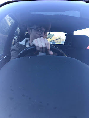

This shot is effective because the actor is making direct eye contact with the camera from a central angle. I like that his hand is on the wheel as though he is either driving or about to set off somewhere; it hints at action taking place within the short film. The fact that you cannot see his mouth makes the shot more effective as it is harder to read his facial expression. From the look in his eyes it looks as though he could be smirking, which gives the actor a more mischievous look. This is effective as people usually stereotype teenagers to be up to no good so it links to the public perception of teenagers too. After analysing the rest of the photos I have decided that I want to use this for the main image on my film poster.
This shot was to experiment from another angle. Having taken some photos from a central angle, in front of the actor, I wanted to see what shots from the side of the car would look like. I like the lighting in this shot, however I prefer seeing the entirety of the actors face. I think having a more central shot is more effective for a film poster so for this reason I disregarded this shot.

The lighting is much brighter in this shot which I do not like because the whole photograph looks like it has a white colour layer over it. Looking away from the camera is less welcoming for an audience therefore I think that if I used this photograph my target audience would not engage in my product. This photo could be used for another product but not as a main image, it could be added on as a smaller image on a magazine review page or another product altogether.
In this shot I decided to move the camera angle and begin to experiment with the different types of lighting. I like the reflection on the car of the trees as I think it brings more depth to the photo. In this shot the actor has his hand in front of his face. He was trying to change his gestures in the photos to make the shots more interesting. I didn't like this particular shot because the actor cannot be seen very well and I wanted his facial expression to be in shot but his hand is in the way.
This was another experimental shot with lighting. I like the way that the tree reflects over the windscreen however it does mean that the actor cannot be seen as clearly as I would have liked. Trees are often a symbol of a life so this image could have deeper connotations of life overpowering this character in particular. The outside of the car has brighter lighting than the inside which could also represent how the character is happy on the outside, but is filled with darkness inside. I thought this shot was clever but I disregarded it as I didn't think it would be effective as a film poster or magazine review page main image.
This is another photo where I had taken a few steps away from the car to see what effect it would give the photograph but I did not like the image that was then taken. The lighting is too bright and there is a slight blur on the photo. The actor is also squinting in this shot therefore I could not use it for my main image in the ancillary tasks. I disregarded this shot.

I like the lighting in this shot and the way that the actor has been framed next to the car. The way he is stood in the middle with the slight blur of the trees in the background means that the focus of the shot is on him, which is ideal for the target audience. It is effective to have an actor as the focus of the shot if they are well known and likely to attract an audience through this. As my short film genre is thriller, I do not think that the actor's expression is fitting and therefore I shall not be using it for either of my ancillary tasks. I am looking for a more dead pan shot to show a more serious side to the characters the actors are taking the role of.

I like this shot because it is simple and the actor is the main focus of the image. She is looking away which connotes she is unaware that the camera is there and that it is a candid shot or that she is looking at something else. This implies that there is something else that she is focusing on, perhaps more important, that does not feature in the shot. The lighting is slightly too dark for what I want from this shot.
This is similar to the previous shot of this actress except she has direct eye contact with the camera, creating a welcoming gaze for the target audience. The slight grin in her facial expression implies she is thinking about being mischievous or up to no good, following the stereotype of teenagers at her age. Another action that connotes this is the hands in her pocket, indicating that she may have something to hide. The fact that she is leaning on the car is also significant because it follows the stereotype that teenagers are careless of other people's property. Looking through my shots I have found others I preferred to use for this actress, so I disregarded this one.
This shot is effective because it is framing the actor. His body language is closed which is not welcoming to the audience, however it does reflect the character's personality. He has direct eye contact with the camera but his hands and the rest of his body are turned away, suggesting that potentially he does not want to be seen. I like this shot however I think it would have been better if he had a different facial expression, so I disregarded it n terms of using it for my ancillary tasks.
I like this shot because I think it portrays a lot of character without the actors having to do anything in particular. The actors in this shot look diverse from other teenagers which makes them stand out and become recognisable to a target audience. I plan to include this shot in my ancillary tasks because I think it is effective in terms of what I would like to portray to the audience.
This shot was to experiment with the lighting and textured background. Taking a candid photograph did not work out as effectively as I planned with this particular shot because the sun was in his eyes and therefore the result of this was that he was squinting. I like the fact that he has his hands in his pockets because this is more closed body language or it could also be considered as suspicious, which is fitting for my short film genre. I disregarded this shot because it was not the facial expression I was hoping for.
I tried a similar photo to the previous one here but moved angles to capture more of a side profile. I like the way this revealed more of his shadow because shadows could connote another, darker side to somebody. The look on his face looks as though he is concentrating or in deep thought which is effective for this particular genre; it is common that people have to consider their each and every move carefully in these films. I disregarded this shot because it wasn't quite what I was looking for but it does have potential for if I were to create another form of advertisement for the film itself.
For the next shot I brought in another one of the actors because I liked the lighting and the textural backdrop. Their facial expressions are effective because they are fairly deadpan and do not reveal what they are thinking. The body language between the two of them is open as one body is facing the other which portrays the chemistry they have as friends. Having a male and female shot openly appeals to a wider range in the target audience. I also like the effect created by the door I left ajar behind them, which implies that there is more to be seen but it is yet to be discovered by the audience- in order to immediately create curiosity and get them to watch the film.
After taking the previous one of these two actors I decided to change angle completely and have them sat on the floor while I take the photograph from the front, central angle. I decided to do a shot where one of the was looking at the camera to catch the direct gaze from the audience, whilst the other was more candid and looking away. There is a different shadow on this photograph which was created by the low angle shot. This creates a nice effect where half of the shot is in the light and half is in the dark, which has deeper connotations of the two halves of their personalities. After looking through the other photos taken I did decide to disregard this one however.
In this shot I was capturing both of the actors looking away to create a more candid photo to see the effect this would create for the audience. They are both slightly smirking which I like because it gives them a more mischievous appearance, fitting with the perception of youth from an older audience. The mise en scene is also very effective for the look I wanted the characters to have. For my ancillary tasks I decided to use different images of the actors, however I think this shot would be useful for something like a magazine front cover advertising the film (used as a smaller image to go down the side). I disregarded this image for my ancillary tasks.
This two shot frames the actors well because they are positioned so the focus is purely on them. The way they are sat shows that they have closed body language and this is less welcoming to the audience. The lighting is half bright and half in the shadows which links in well to the thriller genre, showing two sides to every person. Unfortunately, because of the lighting in their eyes, the actors are squinting towards the camera which is not an effective facial expression. Although they are not revealing their emotions, squinting looks unprofessional so I disregarded this shot.
I like the lighting in this shot because it highlights the presence of the actress in this shot. The shadows can be seen in the background but the lighting shines down onto her. The use of natural lighting is effective and commonly used in thrillers. Unfortunately, due to the slight pickup of wind, there is hair across her face and we cannot see her whole face. Some would say this is effective as it connotes some of her personality is hidden, but I believe the shot would be better if her whole face was on show and she was gaging direct eye contact with the camera. For this reason I disregarded this image.

Evaluation Question 4